My collection of daily #designsbydice is growing in both number and interest! Here is my weekly critique of all 7 compositions that were created in response to a roll of the dice to determine color scheme, element of art, and design principle.
 |
| 15/100 |
15/100:
- A variety of black & white prints were used for the achromatic/neutral color scheme.
- Texture was achieved by using a metallic bathing suit fabric for the center, along with a variety of textures within the black & white prints (dots, grids, and lines)
- Contrast was further emphasized by adding the skinny strips of opposite value between each wedge.
 |
| 16/100 |
16/100:
- Red-Orange and Blue-Green fabrics were pulled for this complementary color scheme
- Initially I started to cut out teal triangles with no initial design plan. You'll see a few dead-end designs that were briefly explored and abandoned.
- I was looking for something curved/round to contrast the jagged triangles. Once again, arches to the rescue, and I really started to get excited when I cut out the centers of each arch and used them to create a contrasting filler for the other arches.
- This might be one of my favorite #designsbydice this week and possibly in this series!
 |
| 17/100 |
17/100:
- After pulling an analogous color scheme, I started to reach for yellows, greens, and blues. I then remembered some leftover sheer fabrics that were fused for a Fusing the Grid workshop with Sue Benner. I've been wanting to play with sheer fabrics and this would be my opportunity to experiment with transparency.
- I cut out strips and played with spacing between the strips to create a tartan/plaid design.
- Unity was achieved by layering the same sized strips and patterning both vertically and horizontally.
 |
| 18/100 |
18/100:
- While I was tempted to reach for black & white prints for my neutral, I challenged myself to use brown as my neutral. I love how the brown plays beautifully with this rich mix of blue-violet hand dyed fabrics.
- The fabrics have their own subtle texture with an organic stripe for the brown batik and hand dyed textures for the blue-violet Cherrywood fabrics. Additional texture and wonderful movement was achieved by weaving the wavy strips to create a wavy grid. The two dragonflies were carefully cut out from a printed fabric and add a wonderful accent to this composition.
 |
| 19/100 |
19/100:
- I challenged myself to use yellow for this monochromatic design and strived to find a mix of values within my stash of yellow scraps, along with some metallic gold accents.
- The wavy lines radiate out from the center with care to maintain a balance of negative space between each ray, as well as an equal distribution of each fabric to create balance, especially for the metallic gold strips.
- Earlier that day, I was reconnecting with friends from my days of working as a lifeguard at a Girl Scout summer camp. My brain was flooded with wonderful summer camp memories and campire songs about the sun were playing in my head as I worked on this block!
 |
| 20/100 |
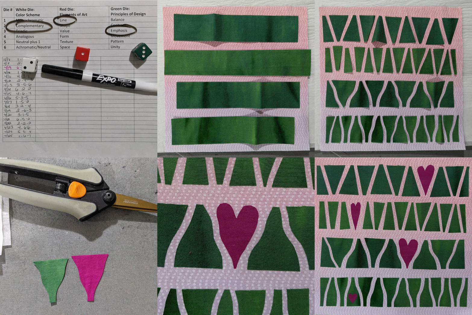
20/100:
- For this complementary color scheme, I chose green and magenta.
- Lines were explored through the use of negative space between each wedge--including straight and wavy lines, and wider horizontal lines separating each row.
- Several wedges were swapped out for magenta hearts which draw the focus, including the small heart in the bottom row.
- As I cut each row, I explored different widths and angles for my cuts, as well as playing with straight and curvy lines. By the time I got to the bottom row, I noticed that several of the cut shapes resembled wine bottles. Coincidence or merely a celebratory sign of hitting the 20-day mark in my 100-Day Project?!?
 |
| 21/100 |
21/100:
- For today's neutral plus 1 color palette, I started with some white-on-white pearlescent prints and mixed them with a variety of aqua blue textured fabrics including solids, Cherrywood hand-dyed fabrics, my own hand-dyed fabrics, Michael Miller Fairy Frost, sheer fabrics (on their own and layered over the other fabrics to yield new shades), and more metallic bathing suit fabric!
- Contrast was achieved through the use of value, as well as the few pops of sparkly fabrics, especially the bathing suit fabric.
Here are all 21 daily compositions!! I love seeing them laid out on my design wall and studying how each new block adds interest to the collection!! I can't believe that I am close to hitting the 25-day mark and soon will have enough blocks to create my first finished quilt in this series. As I am running low on this rainbow ombre background, I will need to choose a new background fabric for the next 25-50 blocks...so change is ahead!! Thanks for joining me on this 100-Day journey!!


You are having so much fun! And your clever ideas pour forth. The perfect distraction for the homebound and really, for any quilter looking to jumpstart creativity. Thanks for sharing.
ReplyDeleteI sure am having lots of fun and totally absorbed in the design process! It's been a most welcome distraction, and has been great for getting me into the studio each day for some creative play. I am looking forward to starting to assemble the collection of blocks into finished quilts...soon!!
Delete