 |
Week 8 Blocks 50-56
|
Eeeek! I am a bit behind on posting my weekly updates as part of my 100 Day Project. Trust me, this has been on each day's to-do list, yet keeps getting bumped by other projects, the heat, and just life in general. I decided I would not partake in any ice cream until I finished my blog post. The freezer is stocked with Friendly's Peanut Butter Cup and Reeses Pieces Sundae cups, so without further ado: let's review the past 2 weeks of #designbydice...
 |
| 50/100--Past the Halfway Point!! |
- As each group of blocks grows, I look for any gaps in colors. When I rolled Monochromatic color scheme, I noticed a lack of orange in Blocks 25-50. Luckily I had recently fused some new orange scraps to supplement my stash. I chose several that had a red-orange hue ranging from a striped print, mottled batik, and a solid.
- This block draws inspiration from some of my favorite free-motion filler designs featuring wavy lines and different filler shapes. Once the striped print was cut into 3 wavy lines, I had fun playing with contrasting shapes to fill in the negative space: skinny & wide strips, parallel line vs. zig zags, circles vs. ovals, rows vs. clusters.
For my 3rd quarter, I chose a variegated brown print for my background. I don't use a lot of brown in my quilting, but whenever I do, I am always pleased. So this will be a fun challenge for the next 25 days. Some of the cut squares are a dark chocolately brown, some with a red tone, and the last is more taupe.
 |
51/100
|
- After rolling analogous colors, I reached for some hand dyed fabric ranging from cool green to blue-violet. Several strips were cut to create my initial bolt, straight lines. A seafoam green hand dyed was used to create contrast with its lighter value, skinny-wavy lines.
- Light and dark valued blue-violet hand dyed solid fabrics create a top and bottom frame, with the addition of a skinny, wavy line from the opposite side. And while the frames are different sizes, there is still a sense of balance and anchoring of the design.
 |
52/100
|
- The brown background is fairly dark, so I find myself using more lighter colors to create my daily compositions. This achromatic/neutral color scheme started with those white shapes (leftover from Block 40/100) Assorted grey hand dyed solids were used as well to create the design.
- Texture was achieved by the smooth flowing edges of the white shapes contrasting with the spikey bursts from the bottom left corner.
- Pattern was achieved by repeating the white shapes into an arc, as well as alternating lighter colored wedges with darker skinny strips for the starburst.
 |
53/100
|
- Watching the news unfold weighed on my heart. I went into the studio to express my feelings through my art.
- Several different pinks and a white fabric were used for the Neutral plus one. The large broken heart with wings floats in the center and is surrounded with contrasting zig zags simulating the tensions.
 |
54/100
|
- Another difficult day of news left me feeling helpless. But then I remembered the one act that we can each do to enact change: Vote!
- Complementary blue and orange fabrics were to create a flag and spell out the words Vote. Hand dyed solids, commercial solids, batiks, and the orange stripe add a variety of textures. Contrast was achieved through the colors, values, shapes, and patterns.
- Mark your calendars for November 3rd and "Vote as if your life depended on it... because it does." - Justin Dart, American Activist
 |
55/100
|
- In response to the recent acts of vandalism and looting, San Jose, CA enacted a mandatory curfew. That evening, I had planned on creating a clock to represent the curfew, but found myself creating a very different design. Different values of black & white prints were cut into strips and overlapped into a chaotic pattern. Surrounded by fiery flames, small gaps of negative space were filled with hearts to represent all the good and love that is abundant within our communites, yet was getting overshadowed by the looting/vandalism by a very few individuals.
- Balance was achieved with the proportion of strips and negative space, flames, and filled in hearts.
- "Darkness cannot drive out darkness; only light can do that. Hate cannot drive out hate; only love can do that." - Martin Luther King, Jr.
 |
56/100
|
- Another difficult day of watching the news and feeling sorrow for so many reasons.
- Analagous colors of blue & green were used to create the irises of eyes watching. While I considered adding more details, I kept the focus on the pupil and iris, with some sparkly bathing suit fabric to create teardrops.
 |
Week 9: Blocks 57-63
|
We'll continue with a review of Week 9's blocks as well...
 |
57/100
|
- This block coincided with Blackout Tuesday, which called for social media silence to reflect. I broke my own rules by not rolling any dice. I simply staarted with a large black square. I reflected on history, recent events, and how I can better advocate for compassion and social justice. I created a large polka dotted heart for the center surrounded with radiating black & white prints.
- Out of respect for the Blackout Tuesday, I waited to post until the next morning with the following quote: "Hope is being able to see that there is light despite all the darkness." -Desmond Tutu, South African Cleric, Anti-apartheid and Human Rights Activist
 |
58/100
|
- A warm colored ombre was used for the analogous color scheme. In honor of all the peaceful protests and marches that were taking place all across the United States and beyond, I set out to create paper dolls as marching protesters. I accordian-folded the strip to cut away the negative space. While each row has slight variations, they are unified with the same basic color scheme and shape. Small love-filled protest signs fill in the negative spaces along the edges.
- Earlier that day, I watched Former President Obama's Town Hall on Racial Justice & Police Reform and felt hopeful, uplifted, and inspired. I included the quote below in my daily post: "When sometimes I feel despair, I just see what's happening with young people all across the country and the talent and the voice and the sophistication that they're displaying, and it makes me feel optimistic. It makes me feel as if this country is going to get better." - Barack Obama, 44th US President, June 3, 2020 Speech
 |
59/100
|
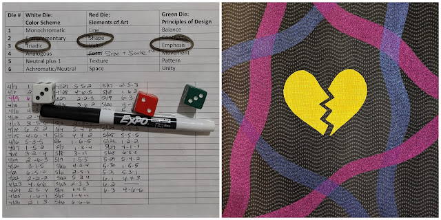
- The next day left me feeling a bit unraveled, which was translated into my daily design. A combination of red and blue sheers were woven into the background, surrounding a broken yellow heart, which stands out given its vibrant color, size, and opaqueness.
 |
60/100
|
- Several light purple circles were cut and layered with wavy lines to create a sun rising and/or setting. That evening I looked out and saw very similar clouds surrounding the nearly full moon overhead.
- Contrast was achieved by the circles vs. lines, dark vs. light values, as well as the changing sizes of the orbs.
- I drew inspiration from one of my favorite childhood books/authors: "Tomorrow is a new day with no mistakes in it...yet." -L.M. Montgomery, Anne of Green Gables
 |
61/100
|
- I learned that a dear friend and fellow artist lost her year-long battle with Pancreatic cancer the night before. I was so thankful that I had the opportunity to talk with her a few days ago. As we were wrapping up our phone call, I suddenly blurted out "I love you." Something inside of me must have known the end was near...
- In her honor, I created a trio of calla lilies (and snuck in a bit of pink). I love how the flowers are bending and stretching up to the sky. They gave me hope and peace.
 |
63/100
|
- During our evening walk, I spotted some archichoke plants in full bloom. They reminded me of my artist friend and her beautiful "Romanescos Revealed" painted quilt.
- When I returned to my studio, I rolled my dice and immediately reached for complementary red violet/chartreuse to create my own abstraction of the artichoke plant.
- With a photo for inspiration, I had so much fun layering partially fusing strips of purple to create the texture of the crown of purple florets, as well as some cut out clamshells patterning for the petals.
 |
| 63/100 |
- A variety of yellow fabrics were used for my monochromatic color scheme, includng a few gold metallic accents.
- With no plan in place, I started by cutting strips and smaller squares from my collection of yellow scraps to play with patterns. Initially I thought about morse code with dashes and dots. Once I started alternating the strips and squares, I loved how it added wonderful movement. Then I rotated the squares and added small gold accents. At this time, I started to see abstract candles. Initially thinking about a birthday cake, I added a metallic ribbon along the bottom, as well as some differently sized triangles to create confetti dancing up above.
- When I went to search for quotes about candles, I was immediately struck by this one: "There are two ways of spreading light: to be the candle or the mirror that reflects it." -Edith Wharton, American novelist
And there you have Week 8 and 9 blocks, along with some more background and insights about the highs and lows impacting my design process. Below are Blocks 1-63, which I just love seeing laid out together!! Time to celebrate this milestone with an ice cream sundae!!
 |
Blocks 1-63...
|


Such a lot to see here. I'm always amazed at the outpouring of your creativity. My favorite though is the artichoke - beautiful in itself and a lovely reflection of Amy's work. My family always closes conversations with, "I love you." I'm so glad we remind each other of that even in the middle of disagreements. Fewer regrets, too.
ReplyDeleteThanks Ann...I am really enjoying this 100 Day Project journey and the resulting blocks. The artichoke is one of my personal favorites too! What a beautiful way to close all your family conversations, including any disagreements. Thanks for sharing!!
Delete