This week's Project Quilting 15.4 Challenge theme is Hourglass. Participants were instructed to "use an hourglass SHAPE in your project, but you do not have to use the exact hourglass BLOCK."
Early into the week, I researched the symbolism of the hourglass and time was a recurring theme: use of our time, limited time, time running out, etc. The time connection was especially relevant as Project Quilting challenges have a 1-week time limit and much of my week was jam-packed with teaching engagements, thereby limiting my studio time to create this week's PQ entry. Additionally, March 1st is the deadline for submitting small 6" x 8" art quilts for SAQA's (Studio Art Quilt Associates) Spotlight Auction which takes placing during our upcoming April 12-20th Plurality & Heritage Virtual Annual Conference showcasing Europe & the Middle East. To help me save a bit of time, I chose the 6" x 8" format and size for making this week's Project Quilting entry which will double as my Spotlight Auction donation.
My design explorations began by pulling out several previously carved blocks that could be printed into an hourglass shape. And at my mother's suggestion, I gathered a collection of board game hourglass timers, including a few other hourglass-shaped game pieces.
There were certainly many directions to explore here, but those board game hourglass timers inspired me to draft and carve a new set of block prints. Initial test prints were incorproated into a set of Artist Trading Cards as part of my 100 Day Project of Making and Mailing ATCs.
Over the past year or so, I've amassed several commercial alphabet block sets in assorted fonts and sizes which I wanted to use for printing the word "time" into my composition.
Rather than print each letter separately which would have likely led to misalignment and potential typos, I used blue painter's tape to hold the blocks together to help me save time and effort during the printing process.
Each 6" x 8" Spotlight Auction piece will be displayed in mats with a 4.5" x 6.5” opening. These dimensions were drafted onto paper to use as a design guide for exploring layout options to best showcase the various block-printed elements within the viewable area.
During my research phase, I came across this quotes by John Estrin, television producer, writer, and director, that really resonated with me:
"The way we spend our time defines who we are."
After several auditions, I chose to use four focal hourglass prints that each represent the four categories of how I choose to spend my time, as evidenced by the catalog of meetings, projects, and tasks in my weekly bullet journal spreads:
- Creative Play (100 Day Project, mixed media classes, etc)
- Teaching (lectures, workshops, and other business-related tasks)
- SAQA (as I currently serve as Board President which involves several committees, meetings, and tasks, along with participation in many of the global and regional events/programs)
- Personal (ie, medical appointments, dog care, health/fitness, family & friends, household tasks, etc).
The next step was printing onto fabric. To guide the placement and positioning of the block-printed elements, I drafted a grid that was visible through the fabric thanks to the use of a lighbox. A smaller swatch was used for test prints and ink color auditions. An assortment of Ranger Archival Inkpads and one VersaFine inkpad was used for the blockprinting, which included a few ghostprints (printing a second and third time before reinking the block to create more faint prints).
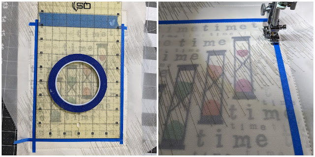
To create the illusion of time fading, I explored the idea of printing onto a sheer fabric. While digging through my collection of sheer swatches, I found a beautiful swatch that had parallel lines of stitching that certainly intrigued me, especially when placed on an angle to match the staggered hourglasses.
Minimal quilting was done to outline each of the hourglasses, which was barely visible once the sheer fabric was layered on top.
The 6" x 8" perimeter was marked with skinny lines of blue painter's tape for a final round of outline stitching. Once the stitching was completed, the quilt was trimmed and the edges were painted with a matching cream-colored Tulip dimensional fabric paint (aka Puffy Paint).
As I was looking through my collection of Fabmo fabric swatches, I found the perfect backing fabric featuring an hourglass repeat print!
Here is the finished piece in it's entirety...
 |
| "tiME" finishes 6" x 8" |
Here is a preview of what it will look like once it is displayed within a mat frame.
Working on this piece certainly gave me time to reflect on how I choose to spend my tiME, thereby defining ME. How do we carve out time for ourselves, especially our creativity?
I invite you to take a few moments to...
1. Reflect on how you choose to spend your time. How might you assign each of these hourglasses related to different aspects of your identity?
2. Check out all the incredible hourglass-inspired PQ entries made this past week!
3. Learn more about the upcoming SAQA Virtual Conference that will be held virtually April 12-20, 2024. Registration is open to guests/visitors and the conference recordings will be available to watch/rewatch for 3 months. And I'll be sure to post information about how you can bid to win this piece and any of the 200+ art quilts that will be included in SAQA's 2024 Spotlight Auction!


every week. every week you amaze me. Love this! WOW!
ReplyDeleteAww... thank you! It was a great prompt to reflect on my priorities and use of time. Looking forward to tomorrow's prize drawing with you and Trish!
DeleteQuite a piece!!!
ReplyDeleteThank you! I had fun packing quite a few layers and meaning into such a small space!
Delete